Dynamic layouts creates clarity
What you are sketchnoting will depend on how you will organise the content. Developing a clear visual path for the reader to follow will help you convey what your sketchnote has to say. Deciding on entry points and exit points will depend on whether the reader will be skimming the content or reading the sketchnote from start to finish. Let’s look at some dynamic layouts that will help organise the contents of the sketchnote and express a clear yet creative visual story.
Directional layout
Directional layout - directs the reader through the information using a mapping system. This process consists of documenting across and down the page, adding segments until you arrive at the end. This layout can be great for a beginning and end story scenario. A natural way to read the page, similar to the traditional reading process.
Mind map layout
Mind map layout - a non-linear layout that contains several elements, including the map’s central idea. Central information is placed in the middle, with images and text shooting out from the centre. Using a mind map is a great way to formulate ideas and concepts at the beginning stages and visually document an overall final outcome.
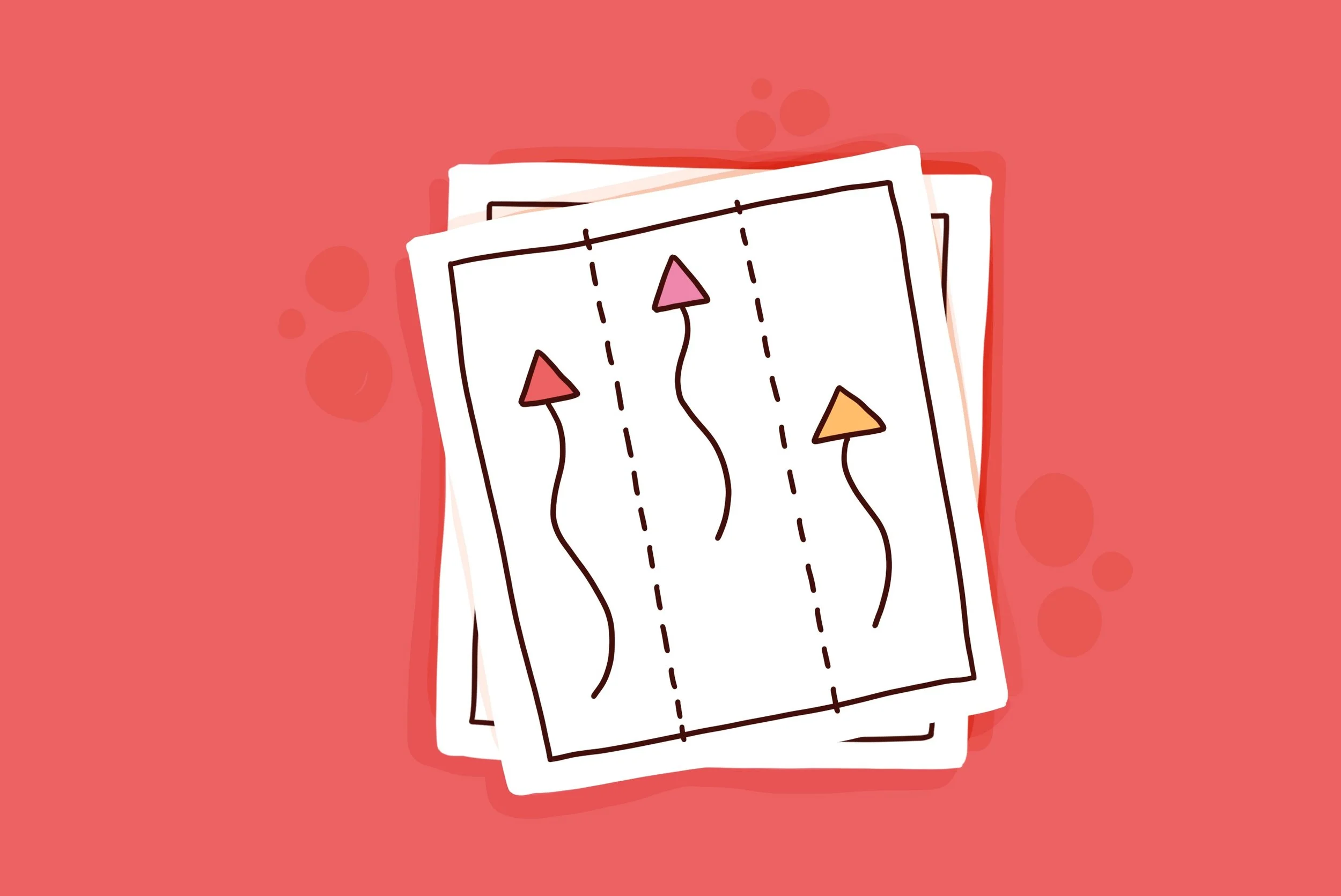
Multi-Column layout
Multi-Column - stable and dynamic, multiple columns can run either vertically or horizontally on the page. Dividing up the page into columns can help separate information and create order and flow when reading. If you would like a stable layout, try an even number of columns. If you want to add dynamic movement to the page, try an odd number of columns.
Modular Grid layout
Modular Grid - are created by applying consistent horizontal and vertical divisions to the page. This option is useful when the modules can take on equal importance or are unrelated and do not need to be read in order. Where there are levels of importance when one module needs to be read before another, think about what hierarchy you could apply. For example, one module could be more prominent in size or a different colour to place higher in the hierarchical order.
Spiral Grid layouts
Spiral Grids - are created by starting at one point on the page and moving through information segments in a circular direction. The contents can proceed in any order, starting at the top, spiralling towards the middle of the page, or it can also be reversed. To create reading in the correct order applying cues will ensure the proper order is read.
We naturally read from left to right and from top to bottom in the English language. However, sketchnotes allow us to be creative using the space on the page in multiple directions. Dynamic layouts challenge the traditional reading direction, which is, of course, the magic of sketchnotes.


